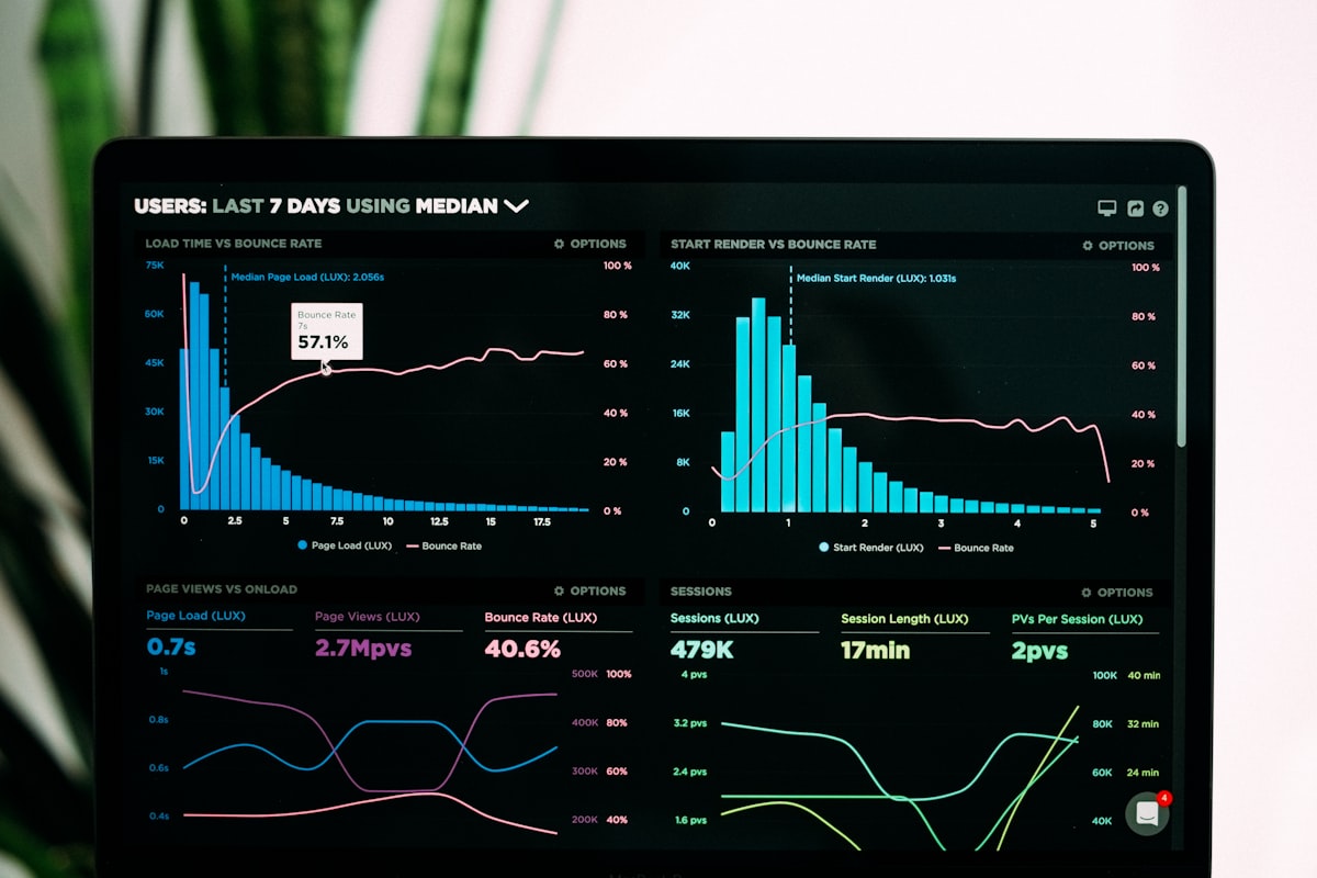
What is Mobile-First Indexing?
Google now primarily uses the mobile version of content for indexing and ranking. This shift means your mobile website's performance directly impacts your search rankings.
Key Principles of Mobile-First Design
1. Responsive Design
Ensure your website adapts to different screen sizes using CSS media queries.
2. Touch-Friendly Navigation
- Appropriate button sizes (minimum 44x44 pixels)
- Sufficient spacing between clickable elements
- Easy-to-use navigation menus
3. Fast Loading on Mobile Networks
Optimize for slower mobile connections by reducing page weight and implementing performance best practices.
Mobile SEO Checklist
- [ ] Mobile-responsive design implemented
- [ ] Viewport meta tag configured
- [ ] Text is readable without zooming
- [ ] No horizontal scrolling required
- [ ] Touch elements properly spaced
- [ ] Mobile page speed optimized
Tools for Mobile Testing
- Google Mobile-Friendly Test
- Chrome DevTools Device Mode
- Responsive Design Checker
Conclusion
Mobile-first indexing is here to stay. By prioritizing mobile optimization, you ensure your website remains competitive in search rankings.